
Most new investors do not even know how to read a stock chart. Regardless of which investment strategy you use it is an important skill to have because so many day traders count on their technical analysis to execute trades.
If you want to be a successful investor, you need to know how to interpret charts and predict price movements based on charts.
You may be confident in a company’s fundamentals or you may have connected a piece of news before anyone else and know that a stock is moving one way or the other; but even if you do not need to use a chart for price predictions it important to be aware of how it works so you’ll understand how others might be predicting price changes.
Technical analysis works because price reflects not only the perceived value and financial standing of a company, but also the psychological pressures of investors that are at play.
How to Read a Stock Chart
A stock chart is full of information. Most people understand line graphs, but if you do not understand the other indicators you will be missing out on some of the most important information.
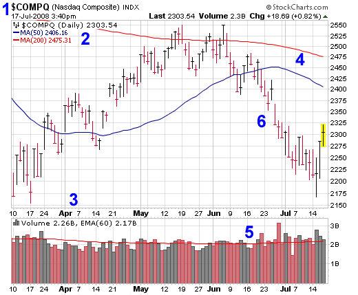
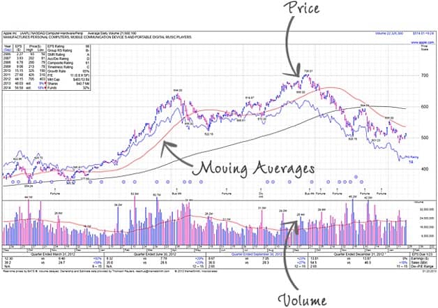
- Stock Chart Identification– Lists the stock name and ticker symbol as well as the date.
- Summary & Key – The summary lists the last price on the index and whether the chart is a daily, monthly or yearly chart. This chart also has 50 and 200 day moving averages and a key for their color.
- Time Elapsed X Axis – The bottom of each chart will indicate the time frame in which we are tracking the stock. This can be expanded or compressed.
- Moving Averages – Moving averages are a way to smooth out the fluctuations when analyzing stocks. It supplies trend indicators over longer periods. This chart shows a 200 day moving average in red and a 50 day moving average in blue. When moving averages cross it can be an indicator of trends changing.
- Volume – With only the stock price you can’t really make an accurate evaluation about how a stock will perform in the future. Volume is an important 2nd data set that will help identify the strength or weakness of trends. Each day is represented by a bar graph line and the 60 day average is indicated by the red line going through them. Higher volume indicates stronger trends.
- Price Range– Each bar represents a trading day. Black bars indicate days where a stock closed at a price higher than it opened, and red bars are days that a stock closed lower. The short horizontal line is the closing price, which many technical analysts consider to be the most important data point.
Candlestick Charts
One of the most important charts for technical analysis is the candlestick chart. A candlestick chart is a lot like the bar chart shown above, but it also shows the open price.
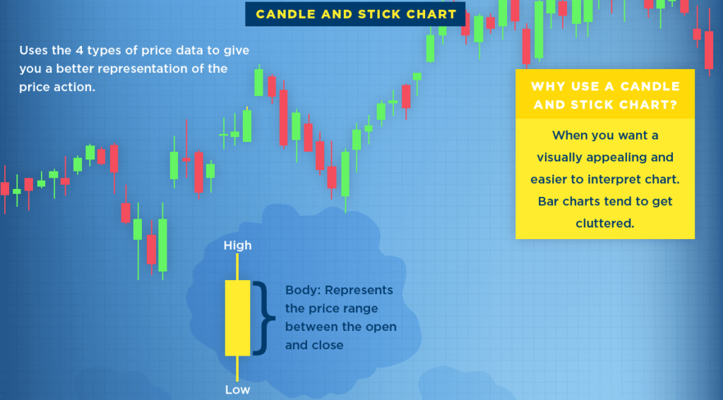
The body of the candle represents the open and closing price while the wicks represent the daily high and low.
Green candles indicate a day where stocks closed higher and red represents days when stocks closed lower.
Study the Trends
Day traders make trades based on short term fluctuations between support and resistance lines, but it’s important to always know how a stock has performed over the long term. Zoom out and take a look at historical and all time trends first of all.
Once you’re familiar with a stock’s historical performance then you can make short term plays on daily and intra-day trading. Focus on stocks that are trending.
Use Trend Lines
The proper way to map trend lines is between successive higher lows (HL) on an up trend and successive peaks (LH or lower highs) on a down trend. The more peaks and valleys that touch the trend line the more it has proven itself. Usually when a stock starts to cross the trend lines it signals an upcoming change in trend.
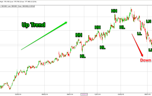
Stocks only trend about 30% of the time. The rest of the time they move sideways in what’s called a trading range. You will want to capitalize on stocks that are trending and avoid trading in a trading range when possible.
Support and Resistance Levels
The whole basis of day trading is identifying support and resistance levels and making trades at those points. If a stock is bouncing between $9.50 and $10.50 you can make $1,000 on 1000 shares. If it repeats this cycle 4 times you can make $4,000.
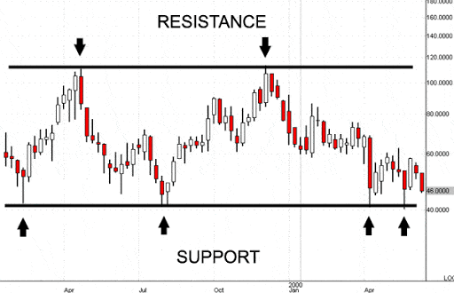
Once a stock breaks out of a resistance level that will often become the new support level, and when a stock starts to trend below a support level that will become the new ceiling.
Confirm Trends with Trade Volume
Always follow moving averages as an indicator of the strength of a trend. Volume can confirm if a trend is still valid or if it is slowing, and can be a huge indicator that a trend change is real.
You should track moving averages for short term, intermediate term and long term volume. Crossing moving averages can be a signal that a trend is reversing.
Track Momentum
The Relative Strength Index (RSI) measures the speed and change of price movements. The RSI is measured between 1-100, with measurements over 70 meaning a stock is overbought and below 30 meaning a stock is oversold.
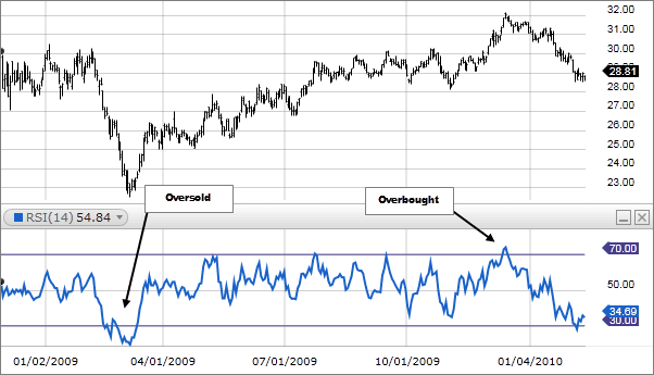
The RSI can be a very solid indicator when a stock is moving sideways between a range. You can also use RSI as an indicator of future trend change when the stock price and RSI are divergent.
In her book Technical Analysis for the Trading Professional Constance Brown suggests that RSI tends to move between 40-90 in a bull market and 10-60 in a bear market.
Use Retracements
Stocks that rally are always subject to a correction after reaching an all time high. They will lose between 30% and 60%.
A popular retracement pattern is derived from the fibonacci sequence; these lines fall at 38% and 62%.
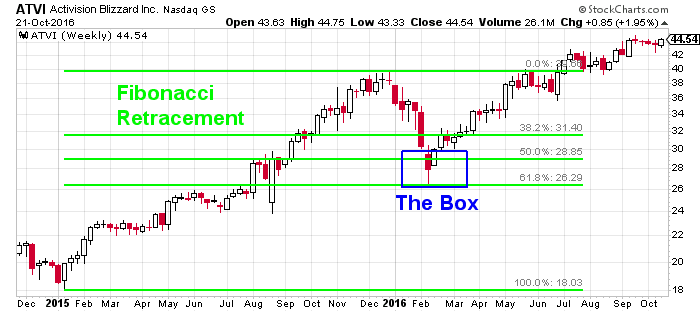
The idea here is to use the retracement of a stock during the previous pullback to gauge the support and resistance levels in the future.
Common Mistakes With Technical Analysis
People will often learn to read charts from a Youtube channel or by looking at other investors charts on a message board and begin applying what they see to their own investments.
This can lead to misplaced confidence and drastic losses.
Applying Technical Analysis At The Wrong Time
Inexperienced traders will learn how to read stock charts and begin applying these techniques to every single chart they see. Price fluctuations are just plain erratic so indicators will falsely present themselves even when there is no basis that a trend will change.
Technical analysis is only applicable when these 3 assumptions are met:
- High liquidity
- No breaking news relevant to the stock, industry or overall market
- No artificial price changes or market manipulation
So it’s not smart to apply technical analysis to stocks that have low liquidity or low volume, during or shortly after related news breaks, or shortly before a stock split or while large investors are moving money in or out of a stock.
Incorrectly Drawing Trend Lines
Many analysts that post videos online are more worried about strengthening their argument than making an accurate analysis. I have witnessed analysts draw trend lines between closing prices and intra-day highs on candlestick charts, cut through a peak just because 2 other peaks better fit their diagram and combine projections from intermediate and short term analysis.
When drawing uptrend lines always use the wick of the candle and draw between higher lows. When drawing downtrend lines always draw between the wicks of lower highs. You can also use the fat part of the candle, but do not draw between the wick of one and the fat part of another.
Each Security Has Its Idiosyncracies
Familiarity with a specific stock can really help analyzing it. For instance when analyzing one high-cap stock the 50 day moving average may be a better indicator, but on another the 70 day moving average could be better. Some stocks are more prone to pressure from their sector. Sometimes you could be confident breaking a rule with a specific stock, but with another it would almost assuredly lead to ruin.
Never look at a new stock and assume that the idiosyncracies you discovered with another stock will hold true. Always start with fundamentally sound analysis and wok your way out from there.
Ignoring the Sector and Overall Market
For many companies it is more important that their industry be performing well as a whole than their actual company. A good example would be energy stocks.
Always employ analysis on indexes that represent a stock’s sector and the market as a whole before making decisions. The sector may show indications of a trend reversal long before a specific company.
Best Free Stock Chart Applications
Now that you have an idea about how to interpret and make predictions with stock charts you just need to familiarize yourself with a quality stock charting software.
Tradingview
Trading View is one of the most powerful free stock chart programs. It is browser based and offers intelligent drawing tools to put your newfound knowledge to work. Trading view is full featured for a free software, but you can get even more with their premium version.
Finviz.com
If it’s not broke don’t fix it. Finviz has offered their basic chart software for free for many years. It also includes a stock screener and heat map.
Yahoo Finance
Yahoo! offers a user friendly stock chart application that offers basic tools as well as comparison and indicator capabilities.
- Bitcoin’s Lightning Network Explained - July 24, 2023
- What is Signature Aggregation? - October 5, 2022
- How John Hwang Built Rainier Arms and His Diverse Personal Investment Portfolio - February 22, 2021